Halation and Accessiblity
As a result of a conversation with Pete yesterday, I did some of my own digging into accessibility and contrast.
The first interesting thing I learned: folks with myopia (which is the medical term for shortsightedness), especially those with Astigmatism, are likely to also have halation, which is a “glow” or a “halo” of bright lights. As a person with Myopia and Astigmatism for most of my life, I didn’t know that the third phenomenon has a name. White text on black background increases this halation to the point of making it hard for me to read the text. For years, I thought it was just my own poor eyesight that does that; turns out it’s much more common.
I’ve never liked harsh contrast for this reason. As a matter of fact, a more “gentle” contrasting theme is one of the reasons I like working in Emacs. My website and my wiki are a result of these preferences. The black text on the beige background is comfortable on my eyes. Enough contrast to read, but not enough to burn text into my vision, as many dark modes out there do.
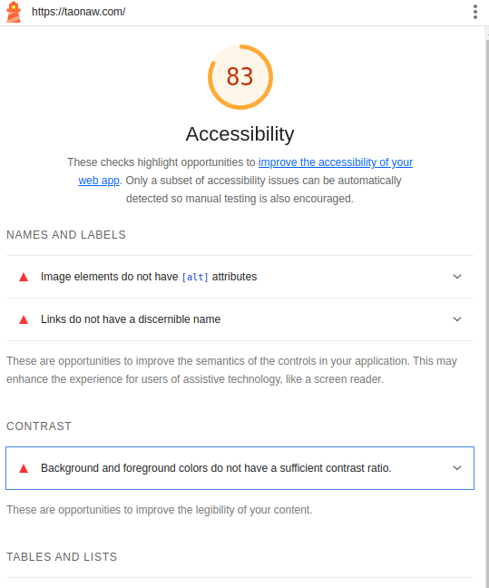
The second interesting thing I learned: Google has a team looking into accessibility, and Chrome has a built-in tool to can check accessibility issues on websites. Here’s an example from my website (my letters-to-background ratio is good enough, as turns out). I’m not sure if Safari and/or Fhaveirefox have these tools.