
First Lechtturm-world problems
I started using my new Leuchtturm1917 last weekend, as predicted. There’s a difference in the paper texture, though I’m not sure it’s such a huge difference from the Moleskin, and the color of the pages seems to be just slightly more creamy, which is nice.
Initially, I thought having pre-purposed space for titles and index (contents) would be beneficial, but it’s actually in the way. Let me show you:
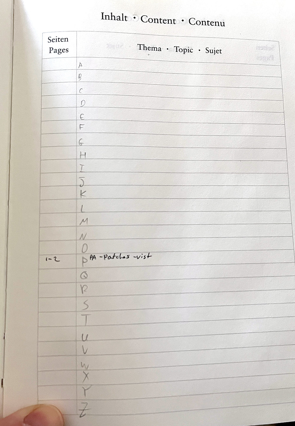
there are 26 lines in three dedicated pages in the content section at the start of the notebook. Naturally, each line can be dedicated to a letter to organized topics. Here is where I encountered a problem: I have three lines - three spots - for each letter across three pages. What if I have five topics under P and none under Z? For now, I think I can squeeze more than a couple in each section, but this is not what was intended. I also need to keep the pages with the topics, which means at some point, I will need to split the length of the “topic” line in the middle to fit more topics and page numbers.
Another issue that occurred to me quickly as I was writing my first three entries was the titles. I don’t start every day neatly with a fresh page; I often stop writing mid-page and start again a couple of days later in the middle. In that case, I write the date and topic manually. Now, the mid-page title doesn’t stand out as the title at the top, giving it a sort of secondary-header feeling.
I’m sure some dedicated Leuchtturm lover will quickly set me straight (Jack?). I’m surprised I didn’t think of this earlier.