
I need to do something about my mobile layout:
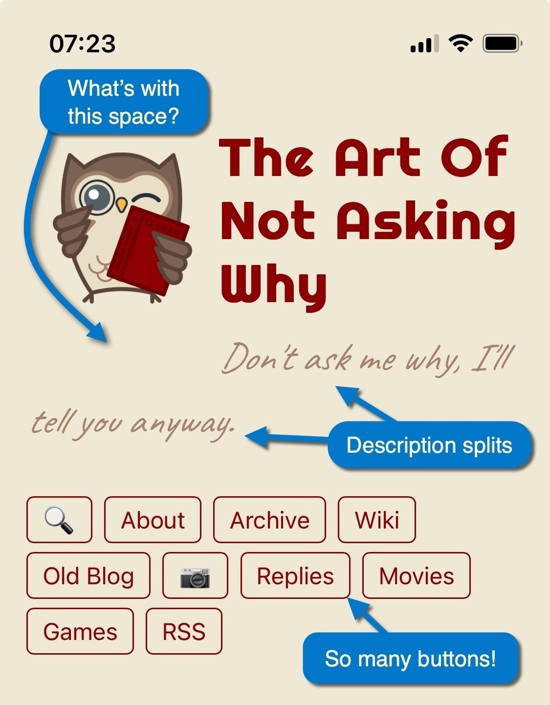
Some fixes are obvious. I can decrease the owl’s bottom margin, preventing the description from splitting (the font might need to be smaller, too). Other fixes are more challenging. I should have fewer buttons, but which to remove or join together? 🤔