
One of the things I realized (again) on this staycation: I am curious and my hunger for technology didn’t go anywhere. It was just squished under layers of workload.

I’m relying increasingly on Journelly to save quick links and notes. It’s swift, and it’s easy to add to org-mode as a project or the agenda
Warfare, 2025 - ★★★½

I decided to watch this on a whim today, and I'm glad I did. This is a difficult movie to watch, not just because of the subject matter but also because there's no real plot or story. I think that's part of the point.
This is an authentic story (as much as I can gather) of one of many instances - and just that, one moment (well, a 90-minute-long moment) of the war in Iraq, with all its horrors. It was created as a memory, like a journal note, of how things were back then for the people who were there; it's not the kind of movie you watch in a theater, eating popcorn.
What I appreciate about this movie is that it doesn't attempt to draw politics in. There's also no attempt at heroism or really any symbolism. It's a simple movie that makes a simple delivery.
Emacs' windows navigations and some Emacs zen
Turns out I didn’t know and forgot about all sorts of built-in fucntions in Emacs that help you navigate windows better. A bit of help from System’s Crafters video and I wised up quite a bit.
Windows in Emacs probably come to you as second nature now, as it does to me, but imagine how it looks to people from the outside for a minute:
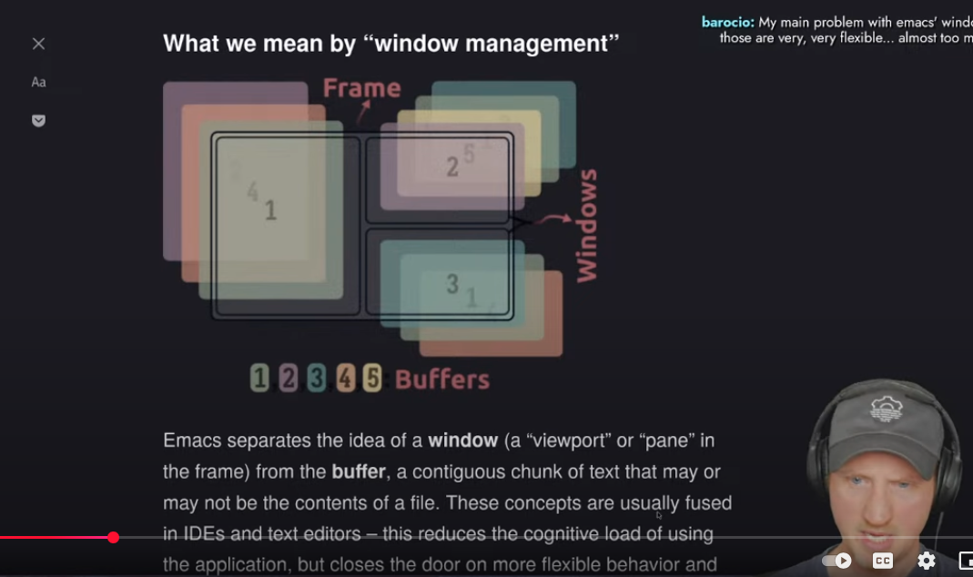
Look at the diagram on the screen. Read the explanation. Look at the “huh?” expression of David of System Crafters (awesome channel for Emacs learning by the way)… Need I say more? 😂
I love Emacs, don’t get me wrong, but when it comes to managing its windows…
A blog check list
A checklist (in org-mode, but it doesn’t have to be) I use to keep my blog perrrrrty. (ok, yes, I need to actuall use it now, I know…)
We started watching Severance, episode 1 of season 1. I only vaguely know what it’s about, but it’s intriguing, so I want to keep at it.
Emacs window management tweaking
Tweaking Emacs’ window management as a way to get tired and go to bed again.
Today I had a switch flip in my brain: what does it take for /me/ to realize that things have gone to shit, and I need a backup plan? I thought about it more calmly over a shower, and I think I’m going to come up with a list.
I just uninstalled the Reddit app again. I use Reddit it and enjoy the community ,but the official Reddit app is a disgusting ads billboard coated with politics I didn’t ask for nor can I block affectively (they come back). On the desktop, there are extensions that work better.
Sleep’s been back to six hours or so a night. Not sure why. I have quiet (besides exicted birds in the morning, but that’s nice), it’s dark enough until later in the day, and I have good air flow. Work is stressful, but not /that/ stressful. Hmm.
I love Emacs, org-mode, and Journelly.
- Show thumbnails in dired so you know which pictures you want to resize, no problem.
- Resize 20 pictures with dwim by mistake because you marked ALL of them. Oops.
- No problem:
dired-mark-files-regexp, mark all files that end with x750, delete with one keystroke - Round two, mark the ones you actually want this time.
- Move them all to the download folder with one keystroke.
Then to organize all my journal entries from journelly.org to journal.org, sort them by the order in the journal, just mark them all and use org sort alphabetically. Poof, done.
A whole day full of notes with pictures is now organized in a way I understand, with work-related notes filed into their tasks neatly, with an org-id link connecting them to the meeting header I have tomorrow.
Can you be more organized than that? Show me one program that does all of that. I didn’t pay anyone, and the software is free.
A month with Journelly
I’ve been using Journelly for a month and have established a workflow. Here are the details, especially the integration between Journelly and Emacs.
I’m so used to watch movies on my computer, I didn’t think getting a new TV would be that much of a difference, but I just got a Sony BRAVIA X90L and boy…
We just watched Dungeons & Dragons: Honor Among Thieves. The depth of the black colors, the sharpness, and the enjoyment of watching it on a big screen… it was /fun/. The movie and the experience. The next upgrade is a Bluetooth hub, so we can have two headphones connected at the same time. This is a smart TV that can stream from my Synology (through my phone), no problem. It has the apps for Netflix, Prime, and Apple TV installed. I’m going to have a lot of fun with this one.
I don’t like Outlook, but I have to use it. I’m trying to integrate it with my other email accounts once more, to have less email craziness going on. We’ll see what happens.
The Shrouds, 2024 - ★★★

I watched this one last night, but it was hard to follow. Not what I expected it to be. I am holding full judgment until I see it again and watch the details more carefully.
On Linux, I now use Pop!_OS, which is dark by default. I find that ef-deuteranopia-dark looks better with my theme there. Meanwhile, on the Mac, ef-frost works for the light theme and ef-night for the dark theme.
Here’s what I do to make this as automatic as possible (F8 is mapped as the key to guggle from light to dark when on the Mac). These are Prot’s EF themes, including the function to switch.
    (cond
     ((eq system-type 'gnu/linux)
      (ef-themes-select 'ef-deuteranopia-dark)
      )
     ((eq system-type 'darwin)
       (mapc #'disable-theme custom-enabled-themes)
       (ef-themes-select 'ef-frost)
       (setq ef-themes-to-toggle '(ef-frost ef-night))
       )
     )
Captured this guy this weekend 📷. We’re enjoying “hunting” birds: Nat identifies them using the Merlin app, and I try to capture them with the camera. It’s not easy, and I’m rusty, but it’s fun!

I really enjoyed Silo. Season 2 ended with a lot of open questions and half-answers, can’t wait for season 3. Seems like Apple TV is the new HBO?
Today in On This Day, I wrote about my attempts to leave Arc Browser after using it both for work and personal stuff for a couple of months. I thought their days were numbered, but they’re still around, and as far as I can tell, enjoy a thriving community of users.
Overall, I’m still more comfortable using three browsers for my three categories of web surfing: Edge for work, Safari for personal, and LibreWolf (trying to keep it on Linux only) for private.