
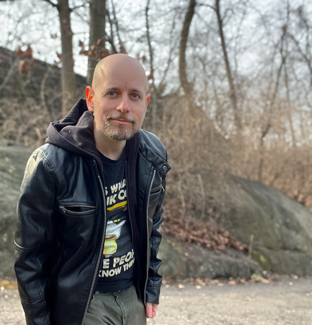
Goofing around at the park
I need to do something about my mobile layout:
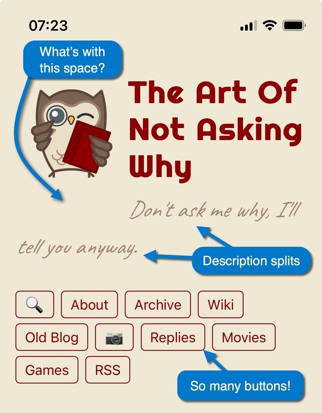
Some fixes are obvious. I can decrease the owl’s bottom margin, preventing the description from splitting (the font might need to be smaller, too). Other fixes are more challenging. I should have fewer buttons, but which to remove or join together? 🤔
A Scanner Darkly, 2006 - ★★★★
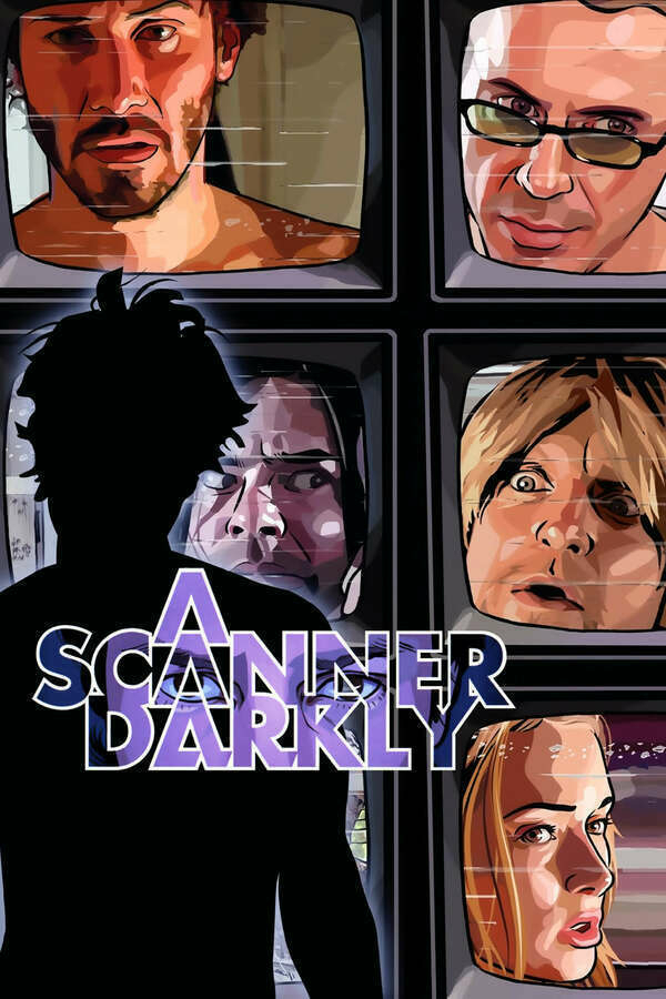
I watched this film before and couldn't follow it. There's so much going on, both visually and dialogue-wise. As odd as it might sound for a rotroscopic animation, the movie feels authentic, perhaps because PHK spent a couple of years around drugs.
At its heart, this is a sad story about a guy slowly losing his mind and his life to drugs, and Keanu Reeves does an excellent job portraying this, while Robert Downey Jr is amazing at being the paranoid conspiracy supermind.
Perhaps what makes this story even sadder is the fact that at the end, when we learn who the real villains are, we shake our heads with a solemn of-course. Like other good movies, it offers a bleak look into a future that is not too far from us right now, one that hopefully we won't get caught with.
Whether you’re fully into the anti-AI movement or not, Reddit’s filing should light some warning lights for you:
We believe we are in the early stages of monetizing our user base…
…Given the value of Reddit’s data in sentiment analysis and trend identification, we believe that there is an emerging opportunity in data licensing. As LLMs continue to grow, we believe that Reddit will be core to the capabilities of organizations that use data as well as the next generation of generative AI and LLM platforms.
Reddit is selling your data and will happily continue to do so, to make more money. Training AI with it is just yet one more way to gain profit from your content.
Credit goes to 404 media (the article is free, but you do need to register):
The long-awaited S-1 filing reveals much of what Reddit users knew and feared: That many of the changes the company has made over the last year in the leadup to an IPO are focused on exerting control over the site, sanitizing parts of the platform, and monetizing user data. The filing says Reddit has already entered into contracts that will pay it at least $203 million over the next 2-3 years for “data licensing” that consists of “allowing third parties to access, search, and analyze data on our platform.
Helldivers 2 (2024) - ★★★★
Let me tell you about MaxiPaine11 (pretty sure that was his name), a random person I found playing this game this morning.
He was waiting for me next to a flag post in the smoldering remains of an outpost. A timer informed us that we had about 2 minutes to hold the spot until the flag would be raised. In the background, I could hear the ominous electronic robotic chipping somewhere nearby - a patrol mission, probably.
Maxi looked busy checking something on the other side of the post next to a vending machine (somehow, these always survive) when I saw them approach. I informed him on the radio, but I wasn’t sure if he got the memo because the next thing I knew, lasers were flying by my head; I leaped to a prone position, took out my sniper rifle, and looked down the scope at the big one at the back of the pack, a meanie with chainsaws for arms. I took my aim slowly, carefully, and squeezed. Well, that got their attention.
There was a THUMP sound nearby. “Democracy needs firepower!” I heard Maxi claim. Soon, I also saw what he called for - a machine gun - as he started raining bullets at the oncoming bot army. That was good; I didn’t know the guy, but his strategy complimented my sniping cautiousness just fine - BOG! I got one right in the head.
The timer ended, and the objective was met, but we had a hell of a fight ahead of us getting out of there to the extraction point. Drop ship after drop ship, the bots kept on coming faster than we could reload our weapons. Things were about to get out of hand. I had an idea. A crazy one, but this is a crazy game. I called in a minefield, focusing right behind us, missing the advancing robots entirely. I got a “?” from him in chat. That’s all he could do before I heard him scream “My leeeeegggggg!!!” as a well-aimed laser blasted it off. My situation wasn’t much better.
I told him to follow me, as I was going back, right into the mines I planted. Then I asked again, and once more, for emphasis, switching weapons to my assault rifle and aiming to his left to show him I was right behind him. He saw me standing between the mines, and then it clicked. He was following me. We rushed through my minefield (as carefully as possible) and ran into the forest, the bots right after us.
We opened a gap between us and the bot army as their fastest killing machines rushed after us right into the mines and exploded. We kept running until we found a big cliff to hide behind. I called for supplies; he called down a torrent to cover us. Good thinking. I checked our map, and well, shit, the extraction point was where the bots came from, right back through the exploding mines, or we could go around it, through what looked like a river.
I turned to him and saluted; Maxi did the same. This time, I followed him - he chose the water. On the other side, Looking ahead, right in our way, was a bot factory surrounded by many glowing evil red eyes. Maxi looked hesitant. And then I died. It happened so quickly.
The bots were everywhere. Maxi didn’t waste time and ran for cover before calling in reinforcement, which was me, of course, as another patriotic solider: “Democracy has landed!” I claimed as I got out of my capsule, right into the depth of an intense fight. We were surrounded. bots from behind, bot-camp ahead, and water that would slow us down to a crawl to the side. It was time to call for additional help, so I shot an SOS beacon to the side. “Thanks,” he managed to voice-prompt me; “Affirmative,” I responded.
But additional reinforcement never came. After many deaths and limbs lost, we managed to get to the extraction spot and escape by the skin of our teeth. This was medium?? Apparently, it was. I saluted Maxi one more time and told him I’ll be back later. Democracy might never sleep, but it does get hungry. Hopefully, I’ll run into Maxi again. Or Someone else, who knows. Every time is a new adventure.
Helldivers 2 (2024) - ★★★★
Let me tell you about MaxiPaine11 (pretty sure that was his name), a random person I found playing this game this morning.
He was waiting for me next to a flag post in the smoldering remains of an outpost. A timer informed us that we had about 2 minutes to hold the spot until the flag would be raised. In the background, I could hear the ominous electronic robotic chipping somewhere nearby - a patrol mission, probably.
Maxi looked busy checking something on the other side of the post next to a vending machine (somehow, these always survive) when I saw them approach. I informed him on the radio, but I wasn’t sure if he got the memo because the next thing I knew, lasers were flying by my head; I leaped to a prone position, took out my sniper rifle, and looked down the scope at the big one at the back of the pack, a meanie with chainsaws for arms. I took my aim slowly, carefully, and squeezed. Well, that got their attention.
There was a THUMP sound nearby. “Democracy needs firepower!” I heard Maxi claim. Soon, I also saw what he called for - a machine gun - as he started raining bullets at the oncoming bot army. That was good; I didn’t know the guy, but his strategy complimented my sniping cautiousness just fine - BOG! I got one right in the head.
The timer ended, and the objective was met, but we had a hell of a fight ahead of us getting out of there to the extraction point. Drop ship after drop ship, the bots kept on coming faster than we could reload our weapons. Things were about to get out of hand. I had an idea. A crazy one, but this is a crazy game. I called in a minefield, focusing right behind us, missing the advancing robots entirely. I got a “?” from him in chat. That’s all he could do before I heard him scream “My leeeeegggggg!!!” as a well-aimed laser blasted it off. My situation wasn’t much better.
I told him to follow me, as I was going back, right into the mines I planted. Then I asked again, and once more, for emphasis, switching weapons to my assault rifle and aiming to his left to show him I was right behind him. He saw me standing between the mines, and then it clicked. He was following me. We rushed through my minefield (as carefully as possible) and ran into the forest, the bots right after us.
We opened a gap between us and the bot army as their fastest killing machines rushed after us right into the mines and exploded. We kept running until we found a big cliff to hide behind. I called for supplies; he called down a torrent to cover us. Good thinking. I checked our map, and well, shit, the extraction point was where the bots came from, right back through the exploding mines, or we could go around it, through what looked like a river.
I turned to him and saluted; Maxi did the same. This time, I followed him - he chose the water. On the other side, Looking ahead, right in our way, was a bot factory surrounded by many glowing evil red eyes. Maxi looked hesitant. And then I died. It happened so quickly.
The bots were everywhere. Maxi didn’t waste time and ran for cover before calling in reinforcement, which was me, of course, as another patriotic solider: “Democracy has landed!” I claimed as I got out of my capsule, right into the depth of an intense fight. We were surrounded. bots from behind, bot-camp ahead, and water that would slow us down to a crawl to the side. It was time to call for additional help, so I shot an SOS beacon to the side. “Thanks,” he managed to voice-prompt me; “Affirmative,” I responded.
But additional reinforcement never came. After many deaths and limbs lost, we managed to get to the extraction spot and escape by the skin of our teeth. This was medium?? Apparently, it was. I saluted Maxi one more time and told him I’ll be back later. Democracy might never sleep, but it does get hungry. Hopefully, I’ll run into Maxi again. Or Someone else, who knows. Every time is a new adventure.
That’s what happens when you use Instagram for news – but is there an alternative? Lot’s of thoughts around this one.
Demoted, Deleted, and Denied: There’s More Than Just Shadowbanning on Instagram – The Markup
Meta declined to comment on why the war photos seemed less likely to appear than other kinds of photos on a hashtag page, despite the fact that they did not violate Instagram’s guidelines on intense, graphic imagery.
Cleaned up my CSS a bit and added more comments to illustrate what I’ve done with TinyTheme. Feel free to borrow ideas! This is an ongoing fun:
    /* Global changes are defined in variables in TinyTheme. These are the theme's default colors, of which we have two sets: light and dark. Instaed of calling a color over and over, we call "link" or "link-visted," etc. Matt, the creator of TinyTheme, explains this here: https://mattlangford.com/2023/06/07/how-to-change.html

    At this point, I have both the same more or less - I only have one theme. I have dark/light theme listed as a todo later on. */


    /* Light Mode */
    :root {
            --text: #666;
            --link: #666;
            --link-visited: #666;
            --link-hover: #8b0000;
            --accent1: #8b0000;
            --accent2: #666666;
            --background: #eee8d5;
            --code: #e3e3e3;
            --button-text: #ffffff;
            --blockquote: #fffee0;
            --note: #FFFF00;
    }

    /* Dark mode */
    @media (prefers-color-scheme: dark) {
        :root {
            --text: #666;
            --link: #666;
            --link-visited: #666;
            --link-hover: #8b0000;
            --accent1: #8b0000;
            --accent2: #f8f8f2;
            --background: #eee8d5;
            --code: ##e3e3e3;
            --button-text: #282a36;
            --blockquote: #fffee0;
            --note: #44475a;
        }
    }


    /* Using the globals colors above, the links' color for the blog are defined here. The links change to crimson red (also defined above) when hovering over them, and keeping the underline, making them easier to identify as links */

    a, a:visited {
        color: var(--link);
        text-decoration: underline;

    }

    a:hover {
        color: var(--link-hover);
        text-decoration: underline;
    }


    /* Change the color of h2 link posts and dates to the red-crimson I use. Because the overall rule for links asks for an underline when hovering over them, I have to specify here that for post titles, I don't want an underline.  */

    h2 a, h2 a:hover, a.post-date.u-url {
        color: #8b0000;
        text-decoration: none;
    }

    /* Change the font and the color of the title to Righteous font, and the color crimson red. The font requires Google Fonts, with additional code in microhook-head.html */

    header h1 a, header h1 a:visited {
        font-family: Righteous;
        color: #8b0000;
    }


    /* To change what the tagline says, we need to use a Microhook: layouts/partials/microhook-description.html. Because by default this description is the same color and font as the text of the blog, I had to create a class here, description. It is also defined in the above microhook.

    The CSS then specifies the color (brown like the owl's bronw), the font (from Google fonts, imported in microhook-head.html), the size, and also makes it italic. */

    p.description  {
        color: #a5846e;
        font-family: "Caveat", cursive;
        font-size: 1.5em;
        font-style: italic;
    }

    /* Change the nav bar boxes links color to my crimson red, and when hovering over them, change the background to gray and the text to the beige color of the blog */

    nav a, nav a:visited {
        color: #8b0000;
        border-color: #8b0000;
    }

    nav a:hover {
        background-color: #666;
        border-color: #8b0000;
        color: #eee8d5;
    }


    /* a border for images in posts only */

    .e-content img {
        border: .2em double #666;
    }

    /* Make the avatar float to the left of the text. TinyTheme uses microhook-profile-photo.html for the image's URL. As well, a bit margin between the avatar and the site's title. */

    .site-header img {
        float: left;
        margin: 1em;
    }
That’s it. My blog’s theme is now based on TinyTheme, with my colors and additions implemented. I will fix a couple more “gotchas” as I notice them. I also want to make my CSS modifications available to everyone soon.

Last night, I finished reading: Starter Villain by John Scalzi 📚.
This was a fun read! Pure entertainment. I chuckled around my apartment reading through this book. It’s not something too heavy or thought-provoking; the best parts are probably the dialogues.
Highly recommended if you own cats!